Enlighten Dashboard
A user-centered and data-driven dashboard that empowers educators to compare students’ performance to their demographically similar peers
Context: CMU Capstone Project
Role: UX Designer
Team: Greg Bunyea, Canhai Chen, Yihong Shi, Jiasi Tan, Kexin Yang
Skills and Tools: Structured Interview, Contextual Inquiry, Think-Aloud, Storyboarding and Speed dating, Paper Prototyping, Wire-framing, Visual Design, Interaction Design, Usability Testing, Sketch, Figma, Principle, Zeplin
Client: Renaissance Learning
Project Background
The 8-month Capstone Project
This project is our capstone project at CMU HCII. Our team is sponsored by Renaissance Learning, and our task was to collaborate with the company and together design and develop a tool which could help increasing user retention rate and number of new users. The target users are school district administrators, and the tool was envisioned to help them to better understand the correlation between students’ performance and their demographic characters.
Client Mission
Mission: “To accelerate learning for all children and adults of all ability levels and ethnic and social backgrounds, worldwide”
About Enlighten Dashdoard
To empower educators the ability of easily comparing achievement and growth to similar schools
Renaissance’s Star computer adaptive assessments help educators screen students, track progress, measure growth, and inform a variety of instructional decisions. Although the Star reports and dashboards provide a wealth of information, there is one unmet need of high interest to educators – namely, the ability to compare achievement and growth to similar schools and classrooms. The normative scores Renaissance currently provide do not take into consideration factors believed to influence achievement and growth including student demographics, per pupil spending, district size, geography, and so forth.
Renaissance’s current dashboard and reports
Why admins want to compare to similar schools?
The ability to compare to similar schools or classrooms would provide powerful insights to school leaders interested in continuous improvement to better understand the effectiveness of their offerings, so they can expand what works and identify areas needing attention. In this project, we’ve been exploring ways to compare achievement and growth to similar schools and our goal is to design, build, and testing the new analytic interface and reports.
Process
The Double Diamond Method
Over the 8 months, we actively engaged the target users population by conducting user interviews, survey, co-design, low-fi to hi-fi prototyping and multiple rounds of usability testing to understand their needs and to iterate on our solution.
Initial Research
Literature Review
We reviewed literature broadly related to our topic in order to shed light on all of our research questions. Since we are interested in methodology of comparing students’ data and visualization we focused on literature regarding learning analytics methodologies.
Insight 1
Selecting the right demographic features has more influences than selecting comparison methodology.
Data Exploration
We also did some quantitative data analysis focused on data-mining of the MDR data (school level demographic data), to find correlations between demographic data and growth using some basic statistical analysis and visualization. For example, the graph to the left (below) tells us that there is a difference between how well a school is doing compared to averages, and how well a school is doing compared to demographically similar peers. The graph to the right tells us that some controllable factors such as teacher-to-student ratio have little effect on students’ performance and growth.
Insight 2
Educators could benefit a lot from knowing demographic contexts when comparing students' performance
Competitive Analysis
To gain an understanding for how data coordinators currently report data and how demographic comparison is currently done, we identified 11 competitive products and analyzed them on two dimensions: Dashboard Quality and Comparison Ability. Overall, these products vary in function and usability, but none of Renaissance’s major competitors provide demographic comparison as we define it. This creates an opportunity for Renaissance to provide more frequent data and create interventions before students take more high-stakes tests.
STRUCTURED INTERVIEW
What information do users need? Why and How?
We conducted 10+ one-hour structured interview with district administrators to understand their data usage and their expectations regarding demographic based comparisons. Overall we want to understand what data they need for demographic comparison, how data informs their decision making, and their general data-use process.
Then we used affinity diagramming to consolidate our interpretations and see how opinions clustered. The affinity diagram generated lots of insights. These insights informed our co-design sessions design, survey design and model building.


Insight 3
Administrators want to compare along different demographic lines
Through our interview, we found administrators care certain demographic factors the most including: Ethnicity, Gender, English Language Learner, Free/Reduced Lunch, School Size, School Type, School Location
Insight 4
Administrators would like to look across sub-groups over time
"It is important to keep track for accountability and closing the gaps between groups."
"Looking at longitudinal trend analysis site to site, window to window or across the system is one way we look at our data. We also like to look at trending data across particular subgroups."
Insight 5
People have different preferences reading data
Not everyone is a data person. Teachers and school leaders usually prefer visuals to raw numbers. When administrators communicate with school leaders and teachers, using raw data can be overwhelming.
“They just want real simple stick. You don’t want to overwhelm them with a lot of data, but usually it’s just how do we compare to others and then are we growing.”
Insight 6
Administrators are open to, but lack convenient ways to find and connect with similar schools
Through our interviews, we found some administrators connect to other schools through personal networks, and some take the time to research and reach out to similar schools.
"Our challenge has always been to find a school that has a similar makeup with our size."
"It will be great if, just say, if you want to know five schools that are like you, boom, here they are! You can reach out to them because they (Renaissance) have those numbers."
SURVEY
What does 'similar' mean to the users?
We also sent a survey to a larger population to gather more quantitative data on which demographic factors administrators would like to use when looking at students’ performance and growth. As shown in the survey, overall administrators valued Free/Reduced Lunch student percentage the most, followed by school size and type. This result serves as a great guidance for us later on on designing the algorithm of the tool.
CO-DESIGN
How do users prioritize and digest information?
We also conducted two co-design sessions with district administrators to understand:
What information they would need given a certain scenario of analyzing or presenting data and how do they prioritize the information.
Their preferred way of visualizing the information in the given scenario.
How they would use this information and communicate the data with others.
Our methods included card sorting and role-playing. Participants were asked to choose scenarios they are interested in, and then sort out cards with information they needed. With this information, they were prompted to describe or draw the visuals they wanted to use for communication. At last, they role-played with the interviewer to show how they would communicate the information with other educators in their school, using data as a reference.


Flow Model
Identify Breakdowns and Opportunities
After our main insights were gained, we developed a Cultural Model to articulate our findings and better inform how administrators currently use data in their work-flow. More importantly, it reveals the value points, and motivations of different stakeholders. It helped us identify the breakdowns of the flow of information between different stakeholders, as well the opportunities we could target as intervention points to design a better product for Renaissance’s users.
The key takeaways of creating this model are the identified opportunities as follows:
Comparing to other demographically similar schools
Connecting to other schools, learn from what other schools are doing
Providing an easier way to help other educators understand data
Providing manipulatable raw data
Automatically generate good visuals
Providing a better way to figure out which subgroup of students needs help
Providing data-driven suggestions on system level interventions
IDEATION
Turn the opportunities into our ideas
After we synthesized our generative research results and identified the breakdowns and opportunities, we did several rounds of ideation and pitching, we then narrowed down the ideas to nine product concepts.


Idea 1 - Community Forum
An on-line community connects schools that have similar demographics. Data Coordinators can learn about that were effective at similar schools to their own.
Idea 2 - Difference Diagram
Each schools’ interventions and resources are mapped on a venn diagram, showing similarities and differences between them. Schools are otherwise demographically similar.
Idea 3 - Intelligent Suggestions
ML techniques analyze demographics and growth data of many schools. The system automatically suggests interventions that would most benefit their school.
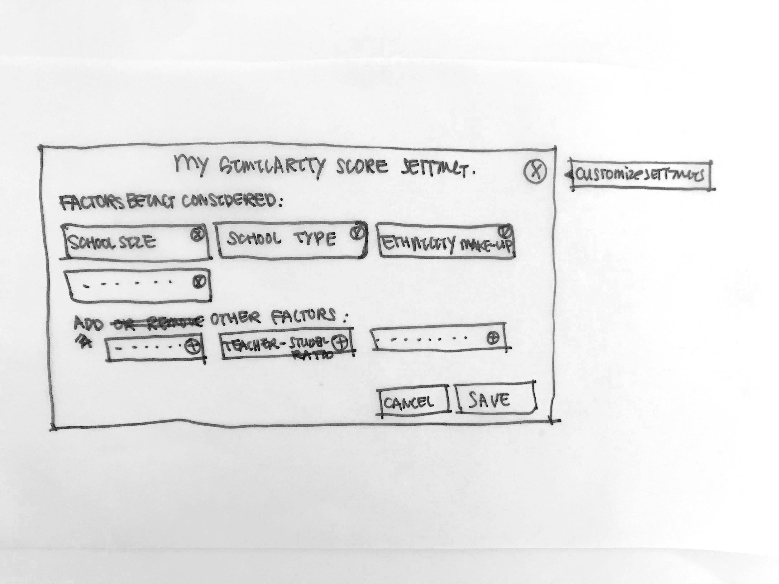
Idea 4 - Similarity Score
A Similarity Score shows how similar schools are in number form. The score is calculated based on a set of variables such as poverty level, school size, ethnicity ratio.
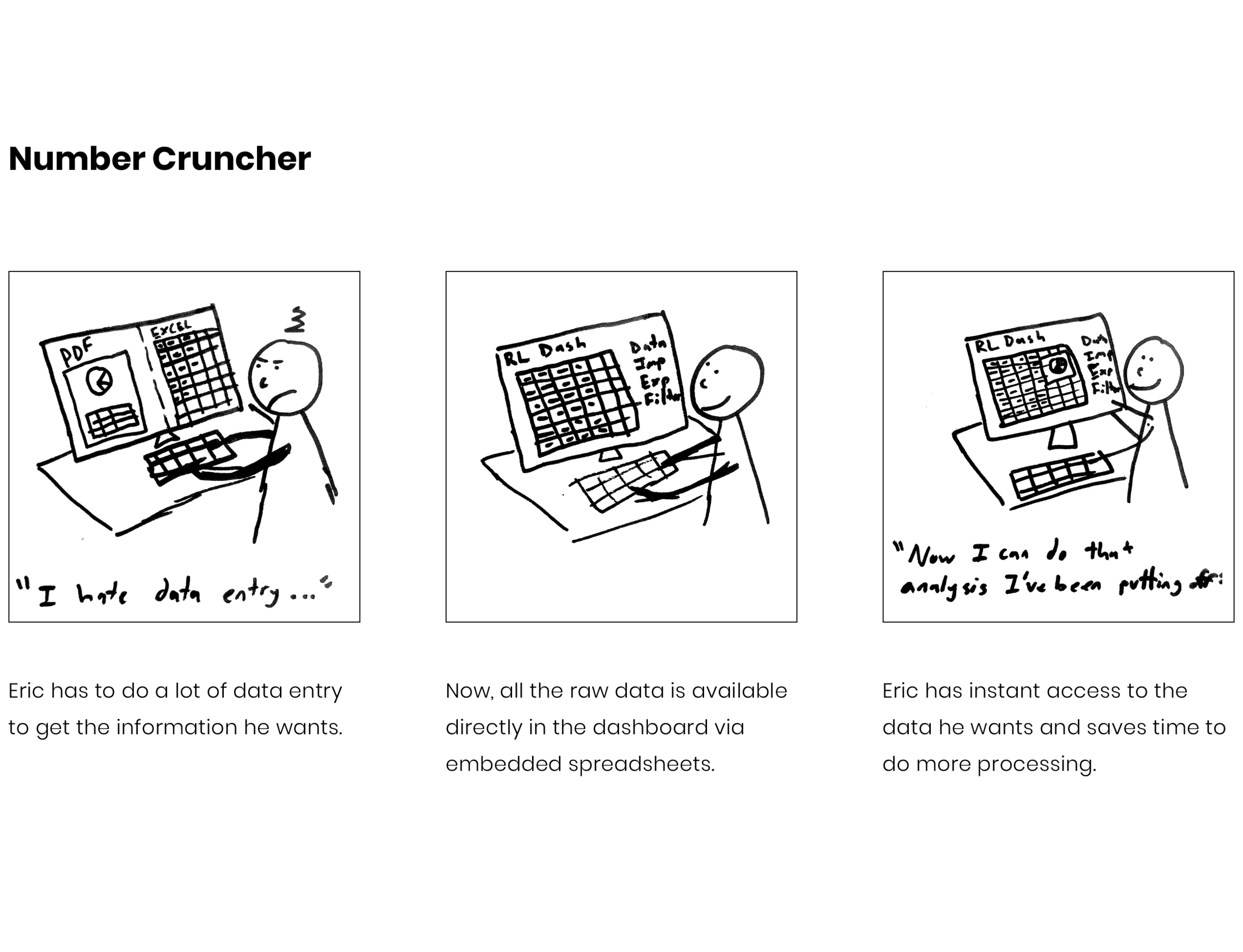
Idea 5 - Number Cruncher
All raw data is kept and processed in-platform. Data is accessible via embedded spreadsheets.
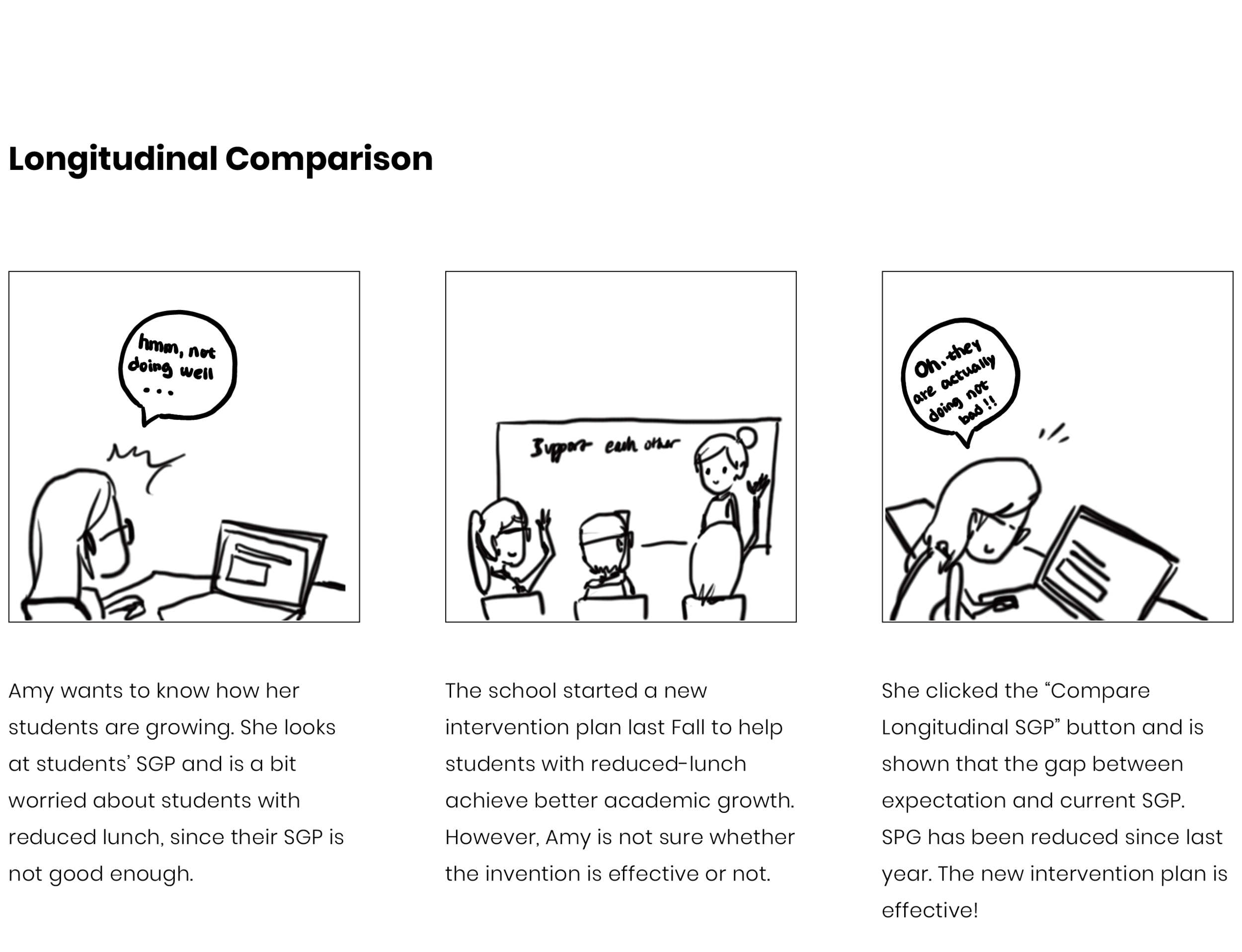
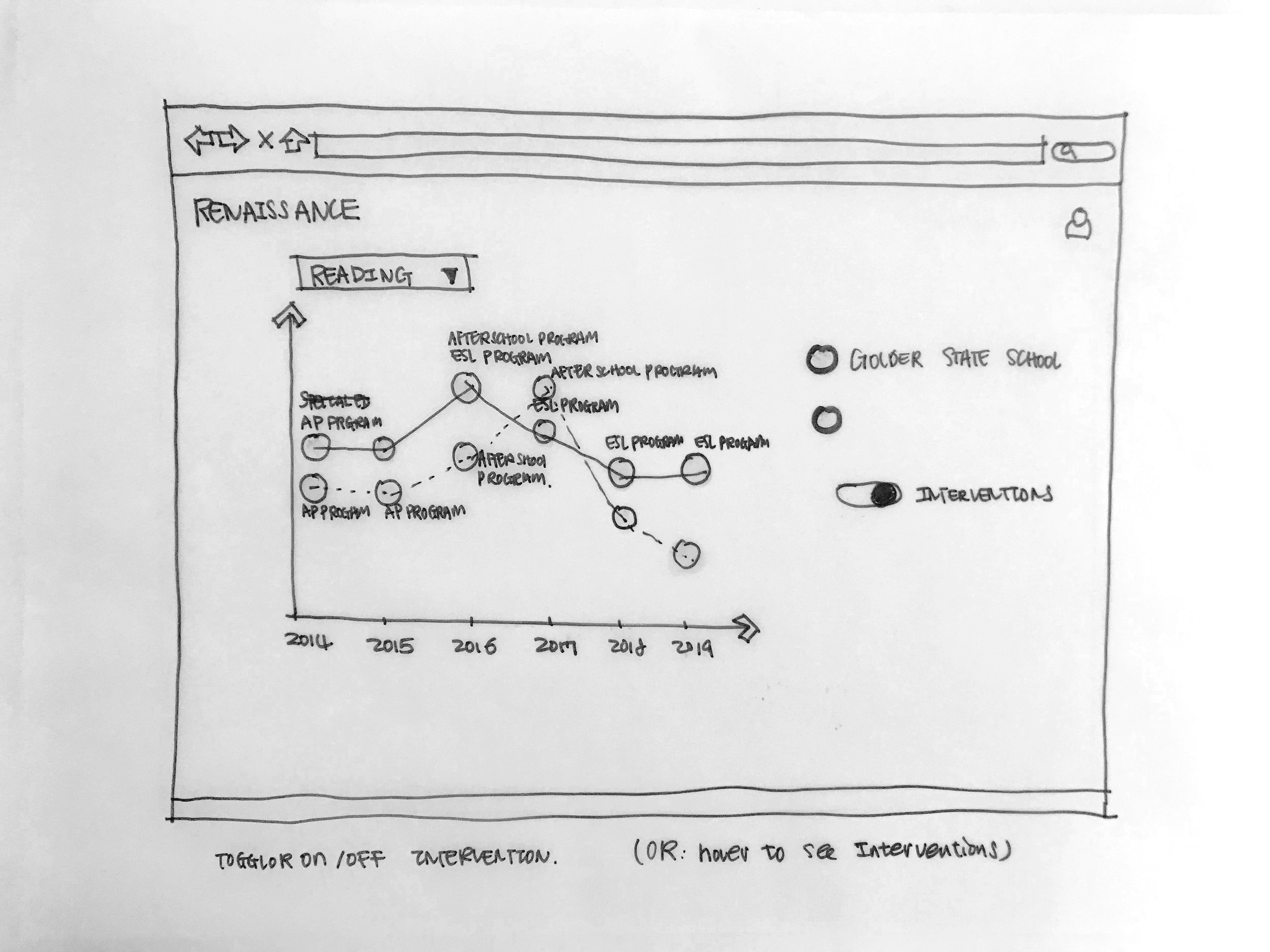
Idea 6 - Longitudinal Comparison
Longitudinal data is shown to display how interventions have or have not been effective over time.
Idea 7 - Custom Presets
Filters, comparisons and reports are customizable. Settings can be saved as presets for use later, saving time on common reports.
Idea 8 - Audience-Sensitive Views
Different views can be switched between that represent data in different views, and quick visualization can be made specific to audience.
Idea 9 - Data Annotation
Data visualizations are customizable and allow for comments or annotation. Visualizations and comments are shared directly with those that need to see them through the platform.
IDEATION EVALUATION
Desirability vs Feasibility
Speed-dating with target users for desirability evaluation
After we generated the 9 product concepts, we conducted 6 speed-dating sessions with potential users to validate their needs and to find out which concepts have higher desirability as well as novelty. We asked our participants to rank the 9 ideas in both desirability and novelty during the speed-dating sessions and give us brief explanation on why. From the speed-dating sessions we got a clear ranking on which ideas are highly desired and the top ones are Similarity Score, Community Forum, and Longitudinal Comparison.
Our team and the client evaluate feasibility
After the speed-dating session, we summarized the result had the spring meeting to report the nine ideas and if the target users find them desirable or not. Another purpose for the spring meeting with our client was to discuss the feasibility of all the concepts in terms of implementation, especially the top-ranked ones by the target users.

Presenting concepts to our client
Summary of Ideation Evaluation
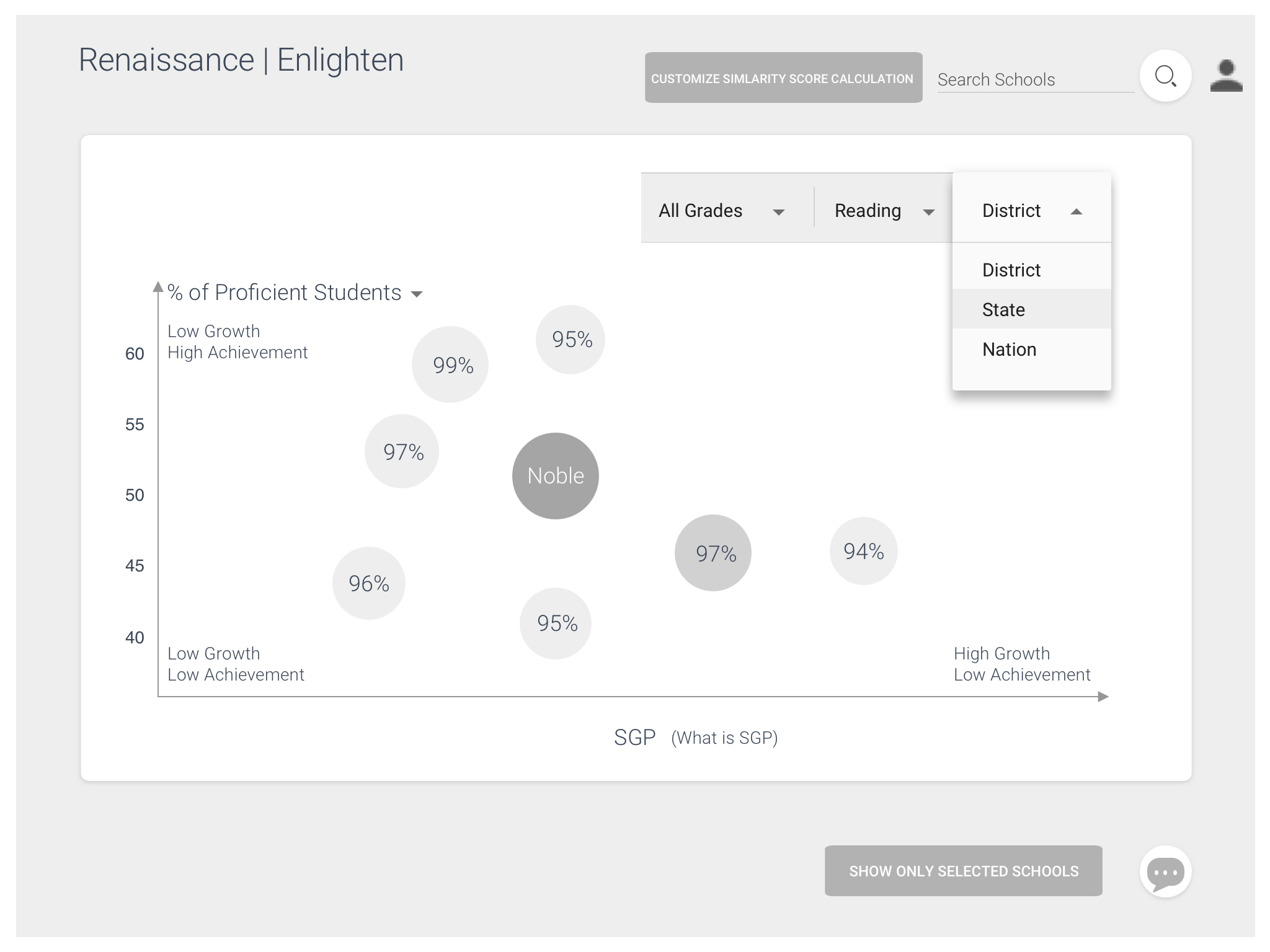
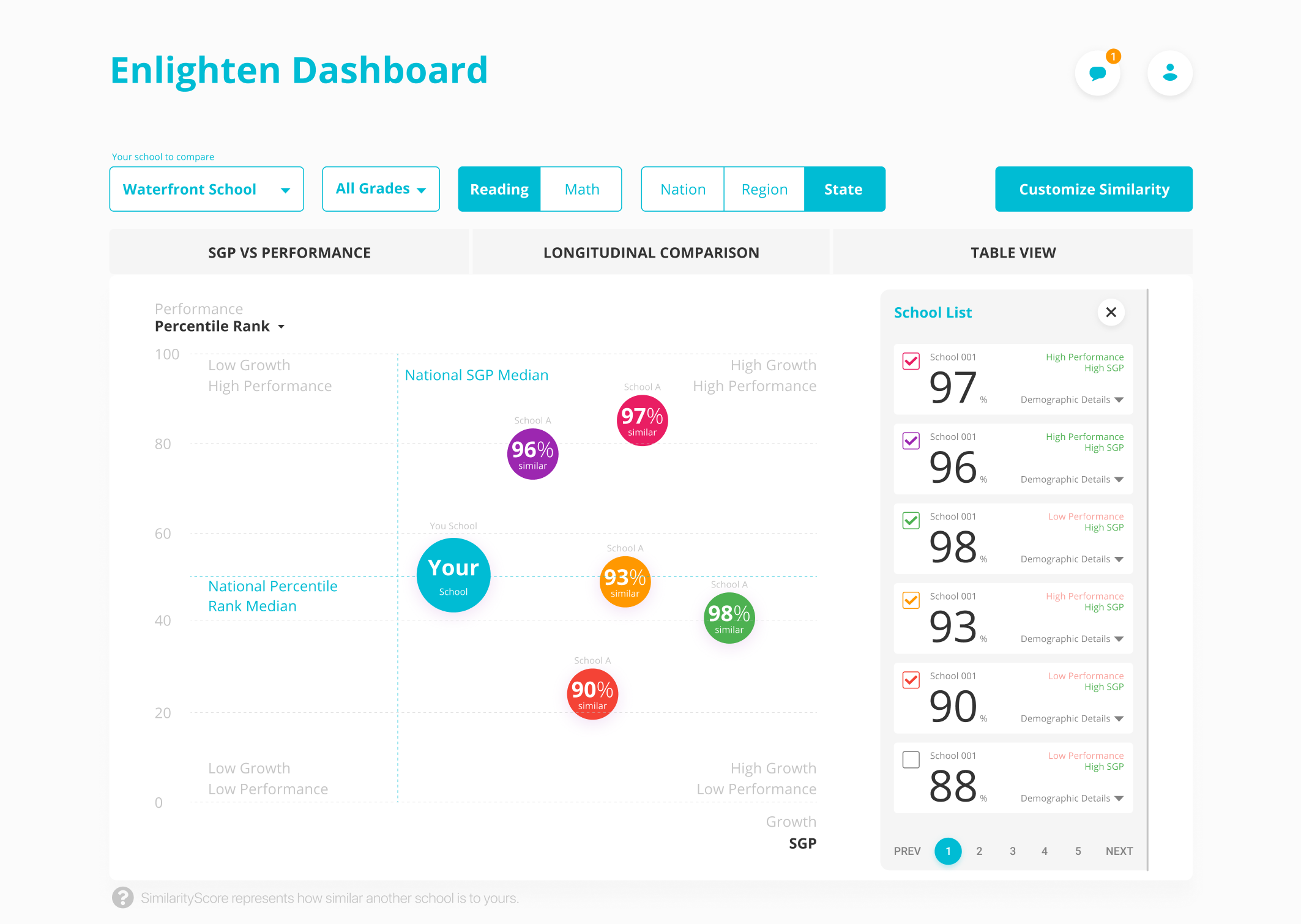
We ended up with the concept called Similarity Score. A Similarity Score shows how demographically similar schools are in number form. The score is calculated based on a set of variables such as poverty level, school size, ethnicity ratio. Also, given both the desirability and feasibility are high on the ideas of community forum and longitudinal comparison, we also decided to integrated the features of providing connecting oppotunity for users and longitudinal comparison view within the tool.

Concept Description
A Similarity Score shows how similar schools are in number form. The score is calculated based on a set of variables such as poverty level, school size, ethnicity ratio.
Iteration
Prototyping and Testing, over and over again
After the spring meeting with our client, we have been prototyping and testing. We usually have several testing sessions each week and then iterate based on feedbacks we gathered from our potential users.
Parallel Prototyping - early white board sketches
Paper Prototyping


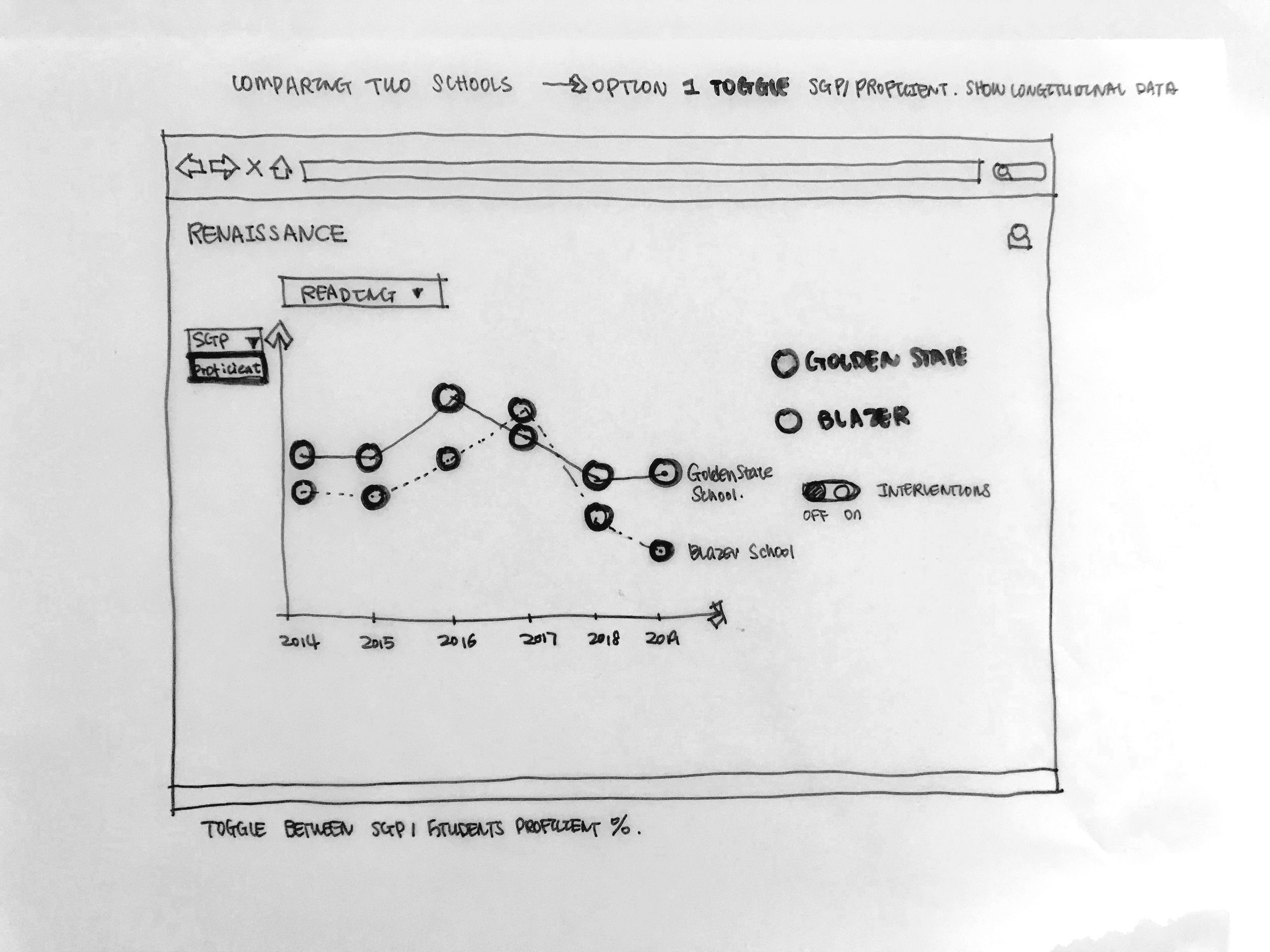
How does it work
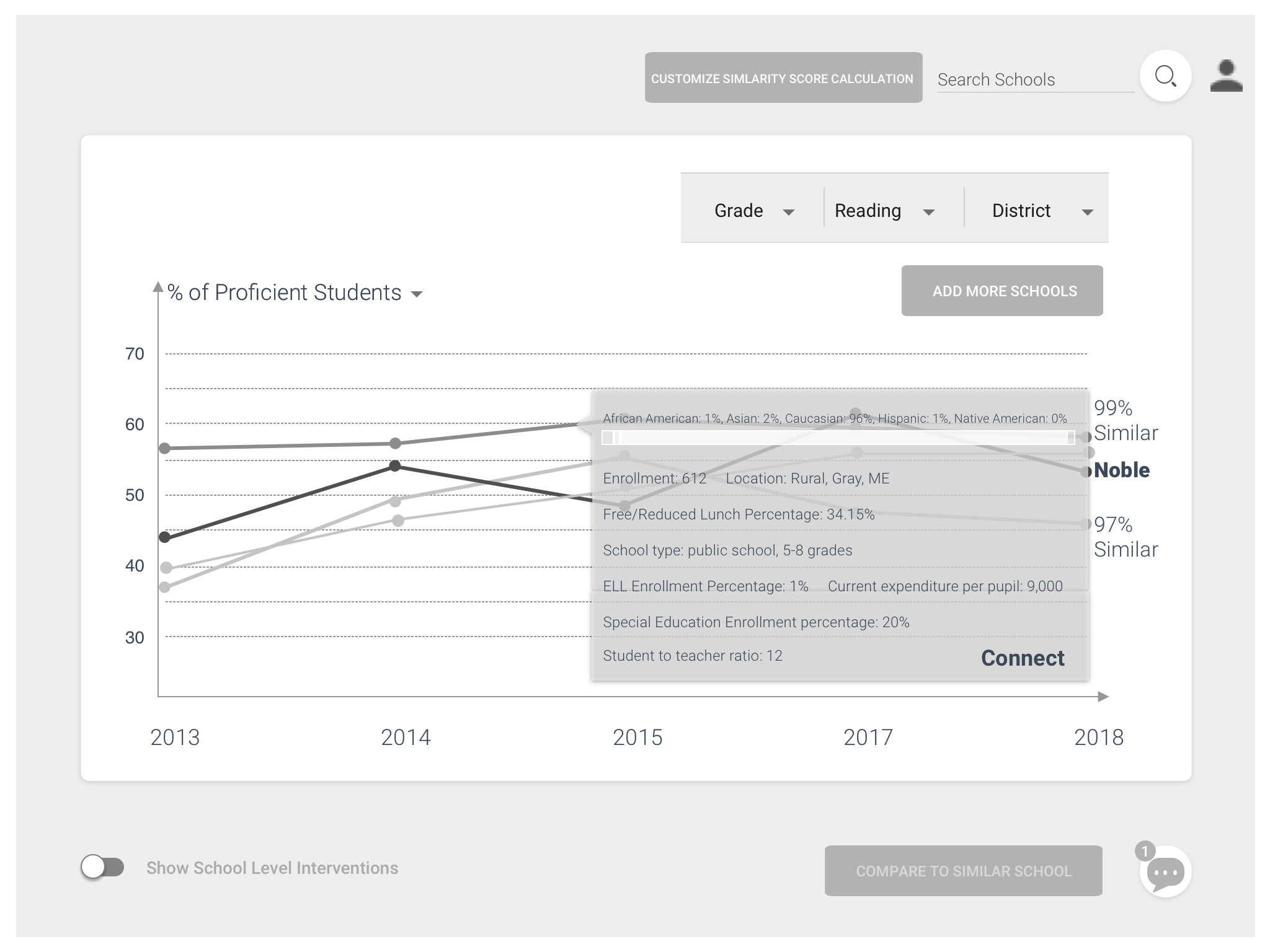
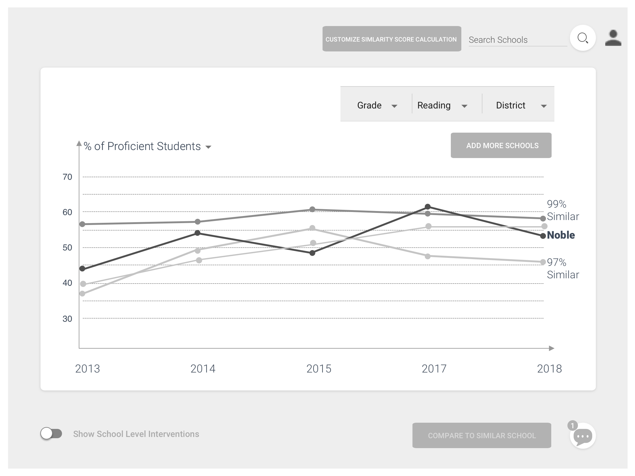
Mid-Fi Wire-framing

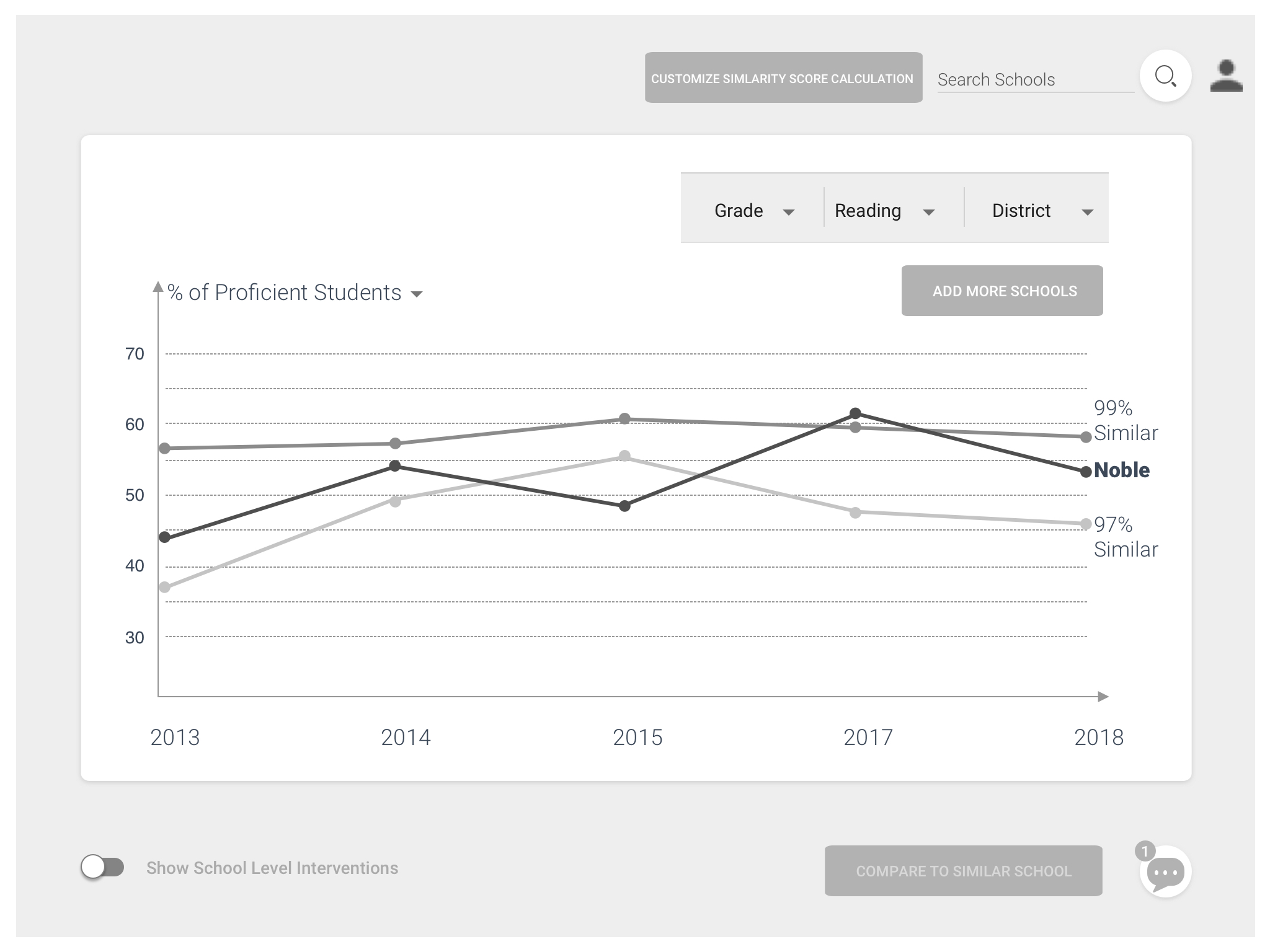


Visual System
Examples of iteration
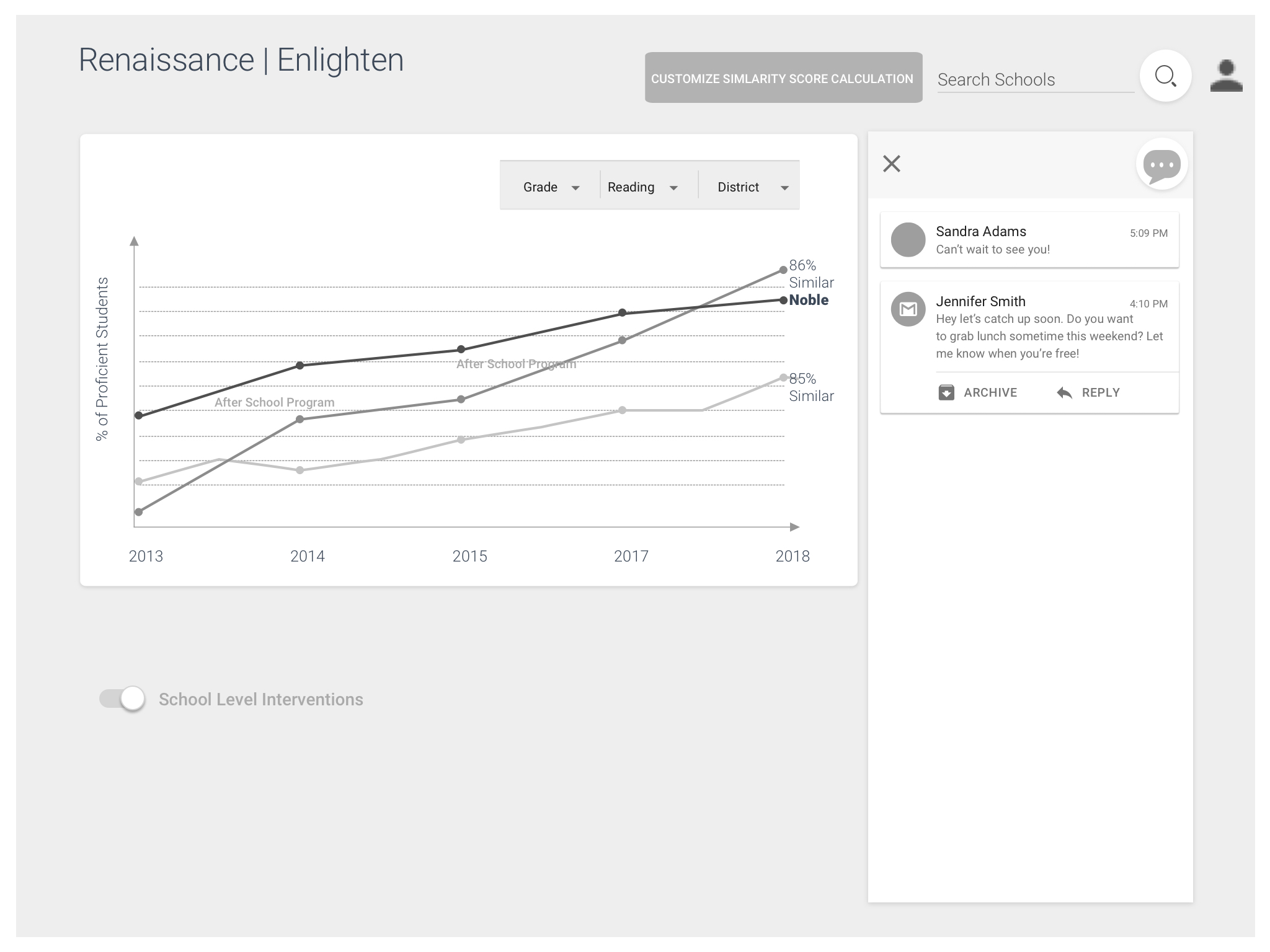
High-Fi Prototype


Reflection
I've learned a lot
I have to say over the past few months, I’ve learned a lot and am proud of both what I learned and what we as a team achieved. Hopefully Renaissance Learning will release the product in a few month and I can’t wait to hear the feedbacks from our users for further evaluation and improvements.
This capstone project also offered me a great opportunity to learn how a product design should work in the real world. We went through the real-world process such as communicating with different departments including data team, legal team, management team as well as UX team. The success of releasing a product are the shard and common effort of all members in the whole journey.
There are a lot of pieces to making a great product. Looking into the details has made me realize there is more than just the looks. It’s about the usefulness, the experience, the problem it solves, and much more.